The secret to a timeless home isn’t avoiding trends; it’s treating your home like a curated gallery, not a fast-fashion closet.
- Build a permanent “Architectural Chassis” with neutral, high-quality materials that don’t need to be changed.
- Use flexible “Style Capsules”—textiles, art, and accessories—to engage with trends in a low-cost, editable way.
Recommendation: Shift from a consumer to a curatorial mindset. Invest in your home’s foundational ‘bones’ and play with affordable, replaceable layers.
You’ve spent countless hours scrolling through Pinterest and Instagram, pinning images of sleek kitchens and serene living rooms. You’re ready to invest, to finally create that modern, sophisticated space you’ve dreamed of. But a nagging fear persists: will the trendy geometric tiles and bold accent wall that look so chic today become the avocado-green shag carpet of tomorrow? This anxiety is valid. In an era of “fast-fashion” interiors, where trends burn brightly and fade quickly, making expensive, permanent choices feels like a high-stakes gamble.
The common advice is often too generic to be truly helpful. “Choose neutrals,” they say. “Invest in quality pieces.” While true, this doesn’t explain how to navigate the powerful allure of the now. It doesn’t provide a framework for creating a home that feels both current and enduring. Many homeowners find themselves paralyzed, either defaulting to a bland, personality-free beige box or taking a risky plunge on a trend that feels dated almost as soon as the contractors leave.
But what if the solution wasn’t about avoiding trends altogether, but about strategically compartmentalizing them? The real key to a future-proof home lies in adopting a curatorial mindset. It involves separating the permanent “architectural chassis” of your home from the flexible, evolving “style capsules” you layer on top. This approach allows you to build a solid, valuable foundation that withstands the test of time while giving you the freedom to play with current aesthetics in a low-risk, high-impact way.
This guide will deconstruct this curatorial method. We will explore how to build a resilient architectural base, identify which popular styles have true staying power, and master the art of using textiles, art, and accessories to keep your home feeling fresh and personal, year after year, without ever needing a major overhaul.
Summary: Crafting an Enduring Aesthetic: A Curatorial Approach
- Why neutral architectural bases sell faster than trendy tiles?
- How to blend mid-century furniture with contemporary architecture?
- Minimalist vs Industrial: which style hides daily wear better?
- The “Farmhouse Chic” elements that are already making homes look old
- How to update a room’s aesthetic using only textiles and art?
- How to style luxury accessories so they stand out?
- Open Shelving vs Closed Cabinets: which maintains order easier?
- How to use flow and color to alter the perceived size of rooms?
Why neutral architectural bases sell faster than trendy tiles?
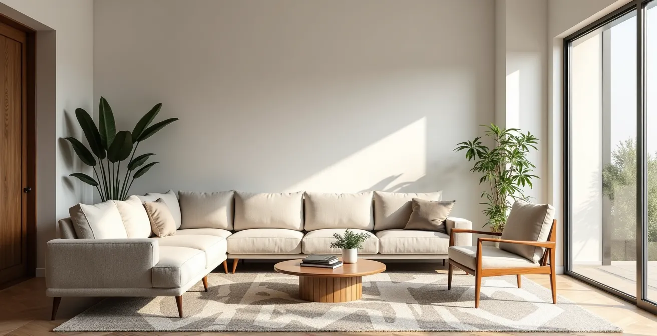
The foundation of a timeless home is its “architectural chassis”—the floors, walls, built-ins, and essential fixtures. Choosing a neutral, high-quality base is not about being boring; it’s a strategic decision about long-term value and flexibility. Highly specific or trendy finishes, like bold patterned tiles or an of-the-moment color, are deeply personal. They force a specific aesthetic onto the entire space, making it harder for future occupants (including a future version of yourself) to layer their own personality on top. A neutral base acts as a sophisticated, gallery-like canvas, allowing furniture, art, and textiles to be the stars of the show.
This principle has a direct impact on a home’s marketability. A space with a solid, neutral architectural foundation appeals to a broader range of buyers because they can easily envision their own lives and belongings within it. They see potential, not a costly renovation project to undo someone else’s taste. While exact figures vary, the principle holds that homes with broad appeal spend less time on the market. In fact, professional guidance in presenting a home neutrally is a key factor, as recent data from Clever Real Estate shows that sellers who use an agent, often advising on such staging, report significantly higher satisfaction with their selling time compared to those who don’t.
Creating this timeless base involves deliberate choices. Opt for materials with a long history of use, such as natural stone, wood, and classic plaster. These materials have an inherent authenticity that transcends trends. When selecting paint, test warm, earthy neutrals on all four walls to observe how they interact with natural light throughout the day. This creates a rich, dynamic backdrop that feels anything but flat. By honoring the “bones” of your home with a resilient and neutral chassis, you create a valuable asset that provides a stable backdrop for years of stylistic evolution.
How to blend mid-century furniture with contemporary architecture?
Once your neutral architectural chassis is in place, you can begin layering in furniture. The key to timelessness here is to invest in design archetypes rather than fleeting trends. Mid-century modern design, for example, has endured not as a single trend, but as a collection of powerful archetypes: the elegantly tapered leg, the honest use of materials like walnut and leather, and the focus on ergonomic, functional forms. These pieces are popular because they solved fundamental design problems with grace and ingenuity.
When it comes to timeless decor, one of my favorite starting points is looking at the bones of a building.
– Lauren Gilberthorpe, Homes & Gardens Magazine
Blending these classic archetypes, like a beautiful mid-century sideboard or lounge chair, with a clean, contemporary architectural shell creates a powerful dialogue between past and present. The clean lines of modern architecture provide a quiet backdrop that allows the sculptural forms and warm materials of the mid-century pieces to shine. The contrast is what creates interest. The warmth and character of the vintage or archetypal piece prevent the contemporary space from feeling sterile, while the modern space keeps the vintage piece from feeling like a museum relic.
This successful integration showcases a confident, curated approach. It demonstrates an understanding of design history and an appreciation for quality craftsmanship that transcends any single decade.

As seen here, the visual harmony comes from shared principles. Both mid-century and contemporary design often celebrate clean lines, a lack of superfluous ornamentation, and material honesty. The key is to find this common ground. Pair a richly grained wooden chair with a simple white wall and a polished concrete floor. The result is a layered, sophisticated space that feels collected and personal, not decorated “in a style.” It’s this thoughtful combination that ensures the look remains relevant and engaging for decades.
Minimalist vs Industrial: which style hides daily wear better?
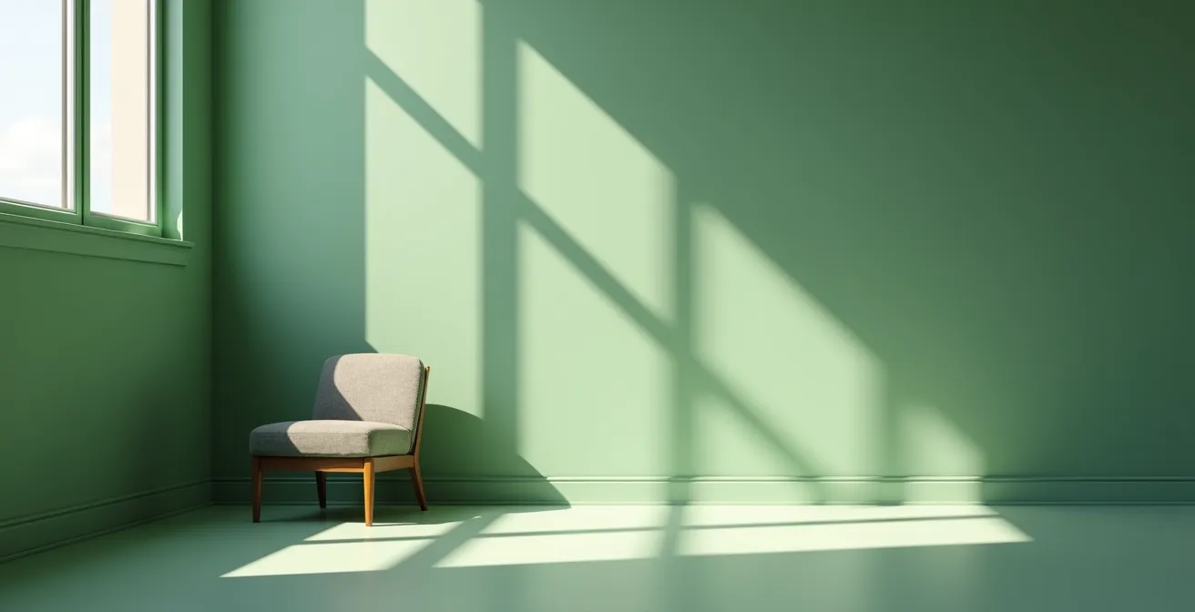
The choice of style for your home’s core elements goes beyond aesthetics; it’s a practical decision about lifestyle and maintenance. Both Minimalism and Industrialism are popular modern approaches, but they handle the realities of daily life very differently. Minimalist design, with its emphasis on flawless surfaces, clean lines, and unadorned spaces, is inherently demanding. Every fingerprint, scratch, or misplaced item becomes immediately visible against the pristine backdrop. While beautiful, it requires constant vigilance and can be unforgiving in a busy household.
Industrial design, on the other hand, is built on the principle of material honesty and the beauty of imperfection. It embraces raw, durable materials like concrete, brick, metal, and reclaimed wood. These materials are not meant to stay perfect; they are designed to age and develop a “design patina” over time. A scratch on a raw steel table or a water mark on a concrete floor doesn’t ruin the look—it adds to its character and history. This makes the industrial style remarkably resilient to the wear and tear of everyday life.
In a direct comparison, the industrial approach offers superior durability and lower maintenance, making it a more practical choice for a long-lasting, livable home.
| Aspect | Minimalist | Industrial |
|---|---|---|
| Material Honesty | Often uses veneers and lacquers | Raw materials: concrete, metal, wood |
| Maintenance Frequency | Daily cleaning required | Weekly to monthly sufficient |
| Wear Visibility | Shows every scratch and mark | Patina adds character |
| Repair Difficulty | Often requires professional refinishing | DIY-friendly repairs |
| Long-term Cost | Higher due to maintenance needs | Lower, ages gracefully |
Case Study: Sophie Paterson’s Grade Listed London Project
In a recent project within a historic London building, Sophie Paterson Interiors expertly demonstrated this principle. The designers needed to integrate modern amenities like air conditioning without compromising the building’s character. Their solution was to convert an antique chest of drawers into a housing for the AC unit. They reinforced the interior to support the mechanics while preserving the chest’s beautifully aged, patinated exterior. This illustrates how an industrial-inspired appreciation for honest, aged materials can cleverly accommodate modern needs, hiding functional wear behind a surface rich with character.
Ultimately, choosing a style that embraces patina is a vote for a more relaxed and sustainable way of living. It frees you from the anxiety of maintaining perfection and allows your home to evolve gracefully alongside you.
The “Farmhouse Chic” elements that are already making homes look old
No trend illustrates the danger of “fast-fashion” interiors better than the recent explosion of “Farmhouse Chic.” What began as an authentic appreciation for rustic simplicity quickly became a mass-marketed caricature, defined by faux-distressed signs, shiplap on every wall, and an overabundance of barn doors. The problem isn’t the rustic aesthetic itself, but its rapid, unthinking replication. When a look becomes a formula that can be bought in a box, it loses its soul and its longevity.
The oversaturation of this trend was fueled by its viral spread online. With an estimated 85% of consumers now using online resources for design inspiration, specific looks can achieve ubiquity almost overnight. This intense exposure leads to equally rapid fatigue. Elements that once felt fresh and charming, like word-art signs saying “Gather” or “Blessed,” now feel generic and, increasingly, dated. They are the decorative equivalent of a catchphrase repeated so often it becomes meaningless.
The antidote is not to abandon rustic or traditional elements, but to seek authenticity over imitation. Instead of faux-distressed finishes, choose pieces with a genuine history or those made from solid, honest materials that will develop their own natural patina. A true timeless rustic look is about texture, craftsmanship, and a connection to nature—not a collection of mass-produced signifiers.
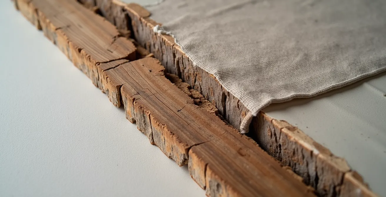
The path forward is a more refined “Modern Rustic” approach. This style favors authentic, unrefined textures over artificial aging. It pairs the roughness of a hand-hewn beam with the smoothness of modern plaster, or the natural weave of linen with the clean lines of a contemporary sofa. This is a curated blend of old and new, rough and smooth, that creates a rich, tactile experience. It’s an aesthetic built on the quality of its materials, not the novelty of its accessories, ensuring it feels grounded and enduring long after the last barn door trend has faded.
How to update a room’s aesthetic using only textiles and art?
This is where the power of the “Style Capsule” comes into play. If your home’s architectural chassis is the timeless, high-quality suit, then textiles and art are the accessories—the tie, the pocket square, the jewelry—that allow you to express current moods and trends without altering the suit itself. This approach gives you immense flexibility and frees you from the fear of making a permanent, expensive mistake. A can of paint or a new set of curtains is a far less daunting commitment than retiling a bathroom.
The most effective way to implement this is by creating a “capsule wardrobe” for your home. Start with a base of high-quality, neutral textiles for large items like sofas and curtains. Think natural fibers like linen, wool, or a durable cotton blend in versatile shades. These are your investment pieces. Then, build a small, rotating collection of accent items. This is where you can play with trends. A couple of velvet cushion covers in a jewel tone, a patterned throw in the color of the year, or a bold new area rug can completely transform the mood of a room for a minimal investment.
Case Study: Havenly’s Timeless Textile Transformation
The design service Havenly often uses this “capsule” method. In one project, a living room with a neutral base of linen curtains and a simple wool rug was the constant. For summer, the room was styled with light-colored cotton pillows and a simple throw. To transition for winter, the designers swapped in just two velvet cushion covers in a deep emerald and a graphic, cozy throw. This minimal, low-cost change radically shifted the room’s atmosphere from airy and casual to warm and inviting, proving that strategic textile choices are the most efficient way to refresh a space.
Art plays an equally crucial role. A single, large-scale piece of art can serve as the color anchor for an entire room. You can pull two or three accent colors from the artwork to inform your choice of pillows, vases, and other small accessories. When you tire of the color scheme, you can either swap the art or simply pull different colors from the same piece, creating a fresh new palette. This method ensures your decor is always cohesive and intentional, yet effortlessly editable.
How to style luxury accessories so they stand out?
In a curated, timeless home, accessories are not clutter; they are the final, punctuating layer of your personal story. They are the moments of intrigue and personality that bring a room to life. However, for luxury or meaningful accessories to truly stand out, they cannot be crowded. The curatorial mindset demands ruthless editing. As designer Ally Dowsing-Reynolds notes, you build a reasonably minimal base and then “add interest and intrigue with your accessories, which can change with the latest trends.” The key is to treat your surfaces—mantelpieces, consoles, bookshelves—like a museum exhibit, not a storage shelf.
This means embracing the power of negative space. Instead of lining up objects in a row, group them into small, thoughtful vignettes. This allows each item to “breathe” and be appreciated individually. An effective technique is to group items in odd numbers, typically one, three, or five, as this is more visually dynamic and pleasing to the eye than even-numbered groupings. Vary the height, shape, and texture within each group to create a sense of rhythm and tension.
Think about creating a narrative. Pair a modern ceramic vase with an old, leather-bound book and a small, sculptural brass object. This trio tells a story of contrasting materials, eras, and forms. The final, critical step is lighting. Use a small, focused art light or a strategically placed lamp to highlight your most cherished pieces, just as a gallery would. This act of deliberate illumination signals importance and draws the eye exactly where you want it.
Action Plan: The Museum Display Method for Your Accessories
- Points of Contact: Identify 3-5 key surfaces for display (e.g., console table, mantel, one section of a bookshelf). Treat these as your “galleries.”
- Collecte: Gather all your potential accessories. Inventory them by material (ceramic, metal, wood) and scale (tall, short, wide).
- Cohérence: For each “gallery,” select a group of 3 or 5 items. Confront them with your room’s core values. Do they tell a cohesive story or do they clash? Edit ruthlessly.
- Mémorabilité/émotion: In each grouping, ensure there is a contrast in texture (smooth vs. rough), scale (tall vs. short), or era (vintage vs. modern). This creates visual interest.
- Plan d’intégration: Arrange your selected vignettes, leaving significant negative space around each. Use a focused light source (like a picture light or small lamp) to spotlight the most important group.
By adopting this disciplined, curatorial approach, your accessories will transition from being mere decoration to being meaningful focal points that elevate the entire space.
Open Shelving vs Closed Cabinets: which maintains order easier?
The choice between open shelving and closed cabinets is a fundamental decision that dramatically impacts a room’s daily maintenance and visual tranquility. It’s a classic battle between aesthetics and practicality. Open shelving, beloved by stylists and on the pages of magazines, forces a “curated” lifestyle. Every plate, glass, and book is on display, demanding constant tidiness. It can be beautiful for showcasing a collection of uniform, aesthetically pleasing items, but it is unforgiving of daily chaos and requires frequent dusting.
Closed cabinets, by contrast, are the champions of practicality. They offer a clean, serene exterior, regardless of the reality hidden behind the doors. This allows for flexible, high-density storage of mismatched items, bulk supplies, and the general detritus of everyday life without creating visual clutter. For most households, a system that allows for hidden chaos is psychologically more restful and far easier to maintain. This practical need is so strong that research from 2023 shows that 80% of homebuyers used online platforms to search for properties, with a significant emphasis placed on practical and ample storage solutions.
A detailed analysis reveals that for most people, closed cabinets offer a superior path to maintaining order with less effort.
| Factor | Open Shelving | Closed Cabinets |
|---|---|---|
| Daily Maintenance | Required – dust visible immediately | Optional – contents hidden |
| Organizational Style | Forced curation | Flexible storage |
| Visual Impact | Always on display | Clean exterior regardless of interior |
| Best For | Beautiful, frequently used items | Everyday items and bulk storage |
| Psychological Effect | Encourages tidiness through visibility | Allows for hidden chaos |
The most timeless and practical solution is often a hybrid one. Use closed cabinetry for 80% of your storage needs to handle the bulk of your items efficiently. Then, incorporate a small amount of open shelving in a strategic location—like a single floating shelf or a niche—to display a few beautiful, frequently used items. This gives you the best of both worlds: the immense practicality of hidden storage combined with a small, manageable moment of curated display.
Key Takeaways
- Prioritize the “Architectural Chassis”: Invest in timeless, neutral foundations like wood floors and simple walls that don’t need to change.
- Embrace “Style Capsules”: Use affordable, replaceable items like textiles, art, and accessories to engage with trends without long-term commitment.
- Choose Styles that Welcome “Patina”: Opt for materials and aesthetics (like Industrial) that age gracefully and hide wear, rather than those (like Minimalism) that demand perfection.
How to use flow and color to alter the perceived size of rooms?
Color and flow are the most powerful and cost-effective tools for shaping the experience of a space. They can make a small room feel larger, a large room feel cozier, and guide the eye to create a sense of harmony and order. The key to a timeless palette is to look to the most enduring source of inspiration: nature. As designer Sophie Paterson says, “If a colour works in nature, it will work in your home.” This means favoring complex, earthy tones over pure, primary colors. Think of the muted greens of sage, the warm grays of stone, and the deep blues of a twilight sky.
One of the most effective professional techniques for enhancing space is “color drenching.” This involves painting the walls, trim, and even the ceiling of a room in the same mid-tone color. By erasing the hard lines where different surfaces meet, you blur the boundaries of the room, creating a sense of infinite depth and immersion. This is particularly effective in smaller rooms, as it tricks the eye into perceiving a larger, more cohesive space.
Beyond single-room techniques, consider the flow of color throughout your entire home. To create a sense of expansion, maintain a clear sightline from the entrance to the furthest point of the home, keeping this pathway free of clutter and tall furniture. Use color strategically to manipulate this perception. Cool colors, like blues and greens, are recessive—they make walls appear further away. Use them on the longest walls of a narrow room to make it feel wider. Warm colors, like terracottas and ochres, advance—they make walls feel closer. Use a warm color on the far wall of a long room to make it feel more intimate and well-proportioned.
By combining these color strategies with a clear visual pathway, you can orchestrate the emotional and spatial experience of your home, creating a narrative that flows logically from one room to the next and feels both expansive and intentional.
By embracing a curatorial mindset—investing in a durable architectural chassis and layering it with personal, editable style capsules—you are not just decorating a house. You are creating a sustainable, valuable, and deeply personal home that has the resilience to outlast fleeting trends and the flexibility to evolve with you for years to come.