Contrary to popular belief, the key to making a chaotic room feel larger and more serene isn’t simply painting it white.
- True spatial perception is manipulated by controlling how the eye sees boundaries, which is often achieved with dark, matte colors.
- The hidden undertone in your paint—not the main color—is what creates either harmony or a sense of visual chaos with your existing decor.
Recommendation: Instead of choosing a color, first define the primary emotional goal for your room (e.g., “calm focus,” “cozy retreat”) and use that as the unbreakable rule for every design decision.
If you’ve ever stood in a room that feels simultaneously cramped and chaotic, you’ve likely been given the same piece of advice: “Just paint it white.” This is the go-to solution for homeowners struggling with disjointed spaces, a simple fix that promises a brighter, larger-feeling room. Yet, many find that a coat of white paint only amplifies the problem, making undertones clash and leaving the space feeling sterile and no less chaotic than before. The frustration of a room that fights you at every turn is a common experience, leading to design paralysis.
The conventional wisdom about light colors expanding space and dark colors constricting it is an oversimplification. It treats color as mere decoration, a skin applied to a room. But what if the true secret wasn’t the color itself, but how it’s used as an architectural and psychological tool? The key to transforming a disjointed room into a serene, expansive-feeling haven lies in a deeper understanding of perception. It’s about mastering the subtle interplay of undertone, light, and visual boundaries to tell the eye a different story about the space it’s in.
This guide moves beyond surface-level tips. We will explore the optical illusions that make a dark room feel infinite, the science behind color harmony, and the critical mistakes to avoid. By the end, you will have a consultant’s framework for using color not just to paint your walls, but to reshape the very feeling of your home.
To help you navigate these advanced concepts, this article is structured to build your expertise step-by-step. Below, the summary outlines the key areas we will cover, from debunking color myths to mastering the technical aspects of light and paint selection.
Summary: A Strategic Guide to Color, Space, and Mood
- Why Painting a Small Room Dark Blue Actually Expands the Space?
- How to Balance Three Colors Without the Room Looking Like a Circus?
- Monochromatic vs Complementary: Which Is More Relaxing for a Bedroom?
- The “White Paint” Mistake That Makes Your Cabinets Look Yellow
- How to Test Paint Samples to See the True Color at Different Times of Day?
- How to Create a Modern Look That Won’t Feel Dated in 5 Years?
- Warm White vs Cool White: Where to Use Each for Maximum Focus?
- When to Walk Away From a Negotiation to Preserve Emotional Control?
Why Painting a Small Room Dark Blue Actually Expands the Space?
The long-standing rule to paint small rooms white is based on a simple principle: light colors reflect light, making a space feel brighter and more open. However, this advice ignores a more powerful psychological trick: the perception of boundaries. In a small room, bright white walls clearly define the corners and edges, constantly reminding your brain of the room’s physical limitations. The space feels bright, but it still feels small and boxy.
A dark, matte color like a deep navy blue or charcoal gray works on an entirely different principle: optical blurring. When the walls and even the ceiling are painted in the same dark, non-reflective finish, the corners and joints where surfaces meet become indistinct. Your eye can no longer easily discern where one wall ends and another begins, creating an illusion of depth and continuity. The room’s boundaries recede into a soft, velvety unknown, making the space feel boundless and intimate, like a night sky.
This “infinity effect” is most potent when the right lighting is used. Instead of a single, harsh overhead light that illuminates everything, using focused accent lighting—like reading lamps or picture lights—creates pools of warm light. These focal points draw your attention while allowing the room’s edges to remain in shadow, further enhancing the perception of limitless space. To properly achieve this effect, follow these steps:
- Choose a matte or flat finish dark paint. Glossy or satin finishes reflect light, which will highlight the room’s boundaries and ruin the illusion.
- Paint all walls, trim, and ideally the ceiling in the same dark shade. This seamless application is critical for blurring the corner lines and creating depth.
- Install focused accent lighting with warm bulbs (around 2700K). This creates inviting pools of light while keeping the room’s physical boundaries in shadow.
Mastering this counter-intuitive technique requires a shift in thinking. Instead of fighting the smallness of a room with brightness, you embrace it with depth, creating a space that feels cozy, sophisticated, and surprisingly expansive.
How to Balance Three Colors Without the Room Looking Like a Circus?
Introducing multiple colors into a room can quickly lead to visual chaos, the very feeling many homeowners want to eliminate. The fear of creating a “circus” often leads to overly safe, monochromatic schemes that can lack personality. The key to successfully using a multi-color palette is not intuition, but a structured, mathematical approach known as the 60-30-10 rule. This classic design principle provides a clear hierarchy for color, ensuring balance and preventing any single hue from overpowering the space.
The rule dictates how to distribute your chosen colors throughout a room by percentage:
- 60% is your dominant color: This is the main color for the room and serves as the backdrop for all other elements. It should be a more muted, lower-saturation hue that sets the overall mood. This color is typically used on the walls, large area rugs, or a large sofa.
- 30% is your secondary color: This color is used to add interest and contrast. It should be about half as prominent as your dominant color. Good candidates for the secondary color include accent chairs, curtains, or a single feature wall. Its saturation level is typically medium.
- 10% is your accent color: This is where you can inject personality with a bold, high-saturation hue. The accent color should be used sparingly to draw the eye and add a final touch of character. Think throw pillows, artwork, lamps, and small decorative objects.
By adhering to this ratio, you create a visual rhythm that the brain finds pleasing and orderly. The dominant color establishes a serene foundation, the secondary color builds interest, and the accent color provides a confident flourish without creating discord. It’s a formula that replaces guesswork with a clear plan for harmony.
The following table breaks down the 60-30-10 rule by function and application, providing a clear roadmap for your color choices, as this detailed guide to color psychology illustrates.
| Percentage | Function | Application | Saturation Level |
|---|---|---|---|
| 60% Dominant | Sets overall mood | Walls, large furniture | Low saturation (muted) |
| 30% Secondary | Adds interest | Upholstery, curtains | Medium saturation |
| 10% Accent | Provides personality | Pillows, artwork, accessories | High saturation (bold) |
Monochromatic vs Complementary: Which Is More Relaxing for a Bedroom?
When designing a bedroom, the primary goal for most is to create a sanctuary of rest and relaxation. The choice between a monochromatic and a complementary color scheme is a critical decision that directly impacts the room’s psychological effect. While complementary schemes (using colors opposite on the color wheel, like blue and orange) create high energy and visual excitement, they are often counterproductive for a space intended for sleep.
For ultimate relaxation, a monochromatic scheme is unequivocally superior. A monochromatic palette uses various tints, tones, and shades of a single color. For example, a bedroom might use a palette of pale blue, slate blue, and deep navy. This approach is inherently calming because it requires very little effort for our brains to process. With minimal color information to decode, the mind is not stimulated or agitated; instead, it can easily enter a state of rest. It’s the visual equivalent of a quiet room.
Complementary schemes, on the other hand, create a high-contrast environment. The juxtaposition of opposing colors is visually dynamic and exciting, which is excellent for a living room or a creative space but disruptive in a bedroom. This high level of stimulation can subconsciously keep your mind active, making it harder to wind down. For a truly restful atmosphere, the goal is to reduce visual noise, not amplify it. Therefore, layering different shades of a single, soothing color like green or blue is the most effective strategy for promoting tranquility and preparing the body and mind for sleep.
The “White Paint” Mistake That Makes Your Cabinets Look Yellow
One of the most common and frustrating design problems is when newly painted white cabinets or trim take on a dingy, yellowed appearance. Homeowners often blame the paint quality or lighting, but the real culprit is almost always a misunderstanding of a critical color concept: undertone harmony. Not all whites are created equal. Every “white” paint has a subtle, hidden base color—its undertone—which can be warm (yellow, pink, beige) or cool (blue, gray, green).
The “yellowing” effect is an optical illusion that occurs when a white paint with a cool undertone is placed next to fixed elements in a room that have warm undertones. For example, if you paint your cabinets with a crisp, blue-undertoned white and your countertops are a creamy, yellow-undertoned granite, the two whites will clash. Your brain perceives the contrast and exaggerates the yellow in the countertop, which then reflects onto the cabinets, making them appear dingy and old. You haven’t chosen the “wrong” white; you’ve chosen a white that is fighting the existing colors in your space.
The key to a cohesive, clean-looking white space is to identify the undertones of your “fixed” elements—things you can’t easily change, like flooring, countertops, and backsplash tile—and then select a white paint that shares the same undertone. This creates a seamless, harmonious look. An analysis of color trends confirmed that homeowners who matched paint undertones to their fixed elements reported 85% higher satisfaction rates, proving that undertone harmony is the true secret to a successful white room.
Action Plan: Auditing Your White Paint Undertones
- Contact Points: Make a list of all distinct white or off-white surfaces in the room, including cabinets, trim, walls, and ceiling.
- Data Collection: Hold a sheet of pure white printer paper against each surface in bright, natural daylight. This contrast will reveal the true undertone of each paint (e.g., does it look more yellow, pink, or gray compared to the pure white paper?).
- Coherence Check: Compare the identified undertones of your painted surfaces to the fixed elements in your room, such as countertops, backsplash, and flooring. Identify any areas where a warm undertone clashes with a cool one.
- Emotional Impact: Assess your light bulbs. Warm-toned bulbs (2700K) cast a yellow light that can make cool whites look sickly, while cool-toned bulbs (4000K+) can make warm whites feel stark. Note how the lighting affects the feeling of the space.
- Integration Plan: Based on your audit, decide on a dominant undertone for the room. Plan to repaint the most jarring, clashing element first, using a new white paint that shares the same undertone as your most important fixed feature (like your countertops).
How to Test Paint Samples to See the True Color at Different Times of Day?
Choosing a paint color based on a small swatch under the harsh fluorescent lights of a hardware store is one of the biggest gambles in interior design. The color you see on that chip is almost never the color you will see on your walls. This phenomenon, known as metamerism, is the tendency for colors to appear different under various light sources. The same shade of gray can look cool and blue in the morning sunlight, perfectly neutral at midday, and warm or even purplish under your evening lamps.
Light is the most influential factor in color perception. Natural daylight changes its color temperature throughout the day, from the cool, blue-white light of morning to the warm, yellow-orange glow of sunset. Artificial lighting adds another layer of complexity; incandescent and warm LED bulbs cast a yellow hue, while cool white fluorescents or LEDs cast a blue hue. Research shows that this variation is not minor; the perceived color can shift up to 40% in perceived hue between natural daylight and standard incandescent lighting.
To see the true, multifaceted nature of a paint color, you must test it properly in the environment where it will live. The best method is to paint a large sample (at least 2×2 feet) on a piece of poster board or drywall. Do not paint a small splotch directly on your current wall, as the existing color will influence your perception. Create two sample boards for each color you’re considering. Place one board on a wall that gets direct sunlight and the other on a darker, shadowed wall. Then, observe them at different times: morning, noon, late afternoon, and at night with your artificial lights on. This is the only way to ensure the color you fall in love with is a color you can live with 24 hours a day.
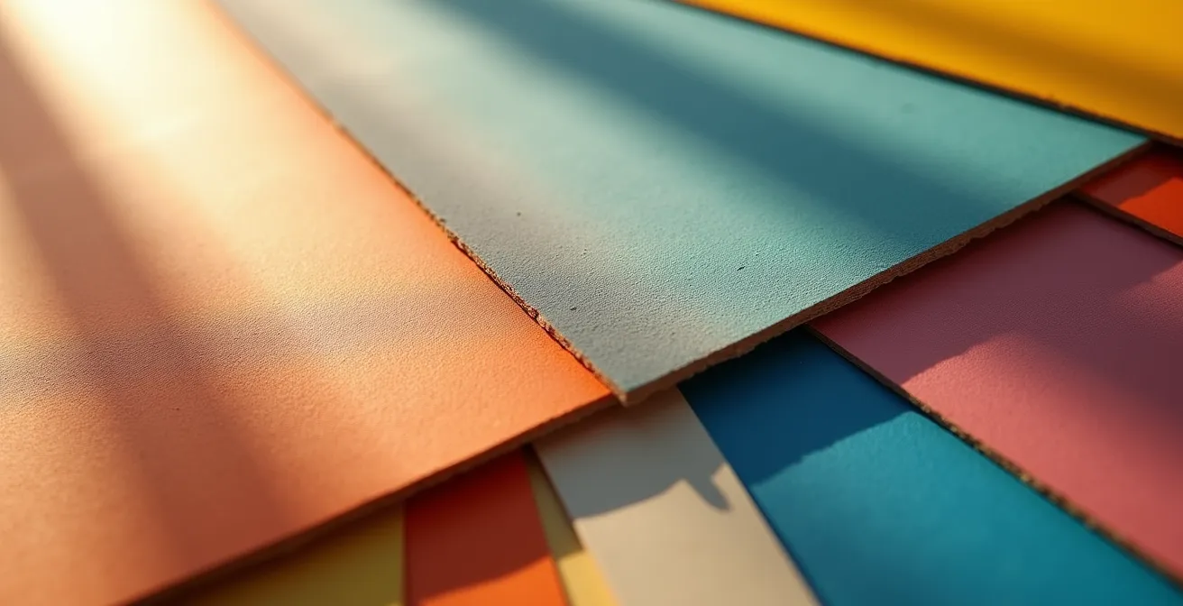
As this image demonstrates, the angle of light and its position throughout the day dramatically alters how a color appears. A single, static test is simply not enough information to make a confident decision.
How to Create a Modern Look That Won’t Feel Dated in 5 Years?
The desire for a modern aesthetic often leads homeowners toward trendy, bold colors that saturate design magazines one year and feel tired and dated the next. Creating a truly timeless modern look is not about chasing trends; it’s about building a durable foundation that allows for evolution. The secret is to distinguish between the “bones” of the room and its “accessories.”
A long-term analysis of color trends has shown that the most enduring palettes are consistently those inspired by nature. A study following homeowner satisfaction over a decade found that rooms painted in biophilic colors—such as earthy neutrals, soft stone grays, deep greens, and muted sky blues—remained popular and required 60% fewer repaints for aesthetic reasons compared to their trend-driven counterparts. These colors work because they are deeply rooted in our collective subconscious, evoking a sense of calm and stability that doesn’t go out of style.
A sophisticated technique to achieve this is “color drenching.” Instead of painting an accent wall, you paint the walls, trim, doors, and even the ceiling in the exact same sophisticated neutral. This creates a seamless, architectural flow that makes a room feel cohesive and intentionally designed. It turns the color into a structural element rather than a decorative one. With this timeless, monochromatic canvas in place, you can introduce current trends through easily replaceable, low-cost items that fall into the “10% accent” category. A trendy terracotta or mustard yellow can be brought in via throw pillows, a vase, or a piece of art. When that trend fades, you can swap these accents for the next new thing at minimal cost, without ever having to touch the timeless bones of the room.
Warm White vs Cool White: Where to Use Each for Maximum Focus?
The choice between warm and cool white light is far more than an aesthetic preference; it’s a tool for regulating your body’s internal clock, or circadian rhythm. The color temperature of your lighting sends powerful signals to your brain that can either enhance focus or promote relaxation. Using the right type of white in the right space at the right time is key to optimizing your home for both productivity and rest.
Cool white light (4000K-5000K) mimics the bright, blue-toned light of the midday sun. When your eyes perceive this type of light, it triggers your brain to suppress the production of melatonin, the hormone that makes you feel sleepy. This biological response boosts alertness, concentration, and cognitive performance. For this reason, cool white light is the ideal choice for “active focus” zones like a home office, kitchen, or workout area. However, it’s crucial to use this light strategically during the day (e.g., 9 am to 3 pm), as exposure to cool white light in the evening can disrupt your sleep cycle.
Warm white light (2700K-3000K), conversely, emulates the gentle, yellow-orange glow of a sunset or candlelight. This color temperature has the opposite effect on the brain: it allows for natural melatonin production, signaling that it’s time to wind down. This promotes relaxation, comfort, and social bonding. Warm white is perfectly suited for spaces associated with rest and leisure, such as the living room, dining room, and bedroom. Using it in the evenings helps you transition smoothly toward sleep, supporting a healthy circadian rhythm.
For ultimate control, tunable white lighting allows you to adjust the color temperature throughout the day, syncing your indoor environment with the natural light cycle outside. The following table, based on extensive research into how light temperature impacts productivity, provides a clear guide.
| Light Type | Temperature | Best Time | Ideal Rooms | Psychological Effect |
|---|---|---|---|---|
| Cool White | 4000K-5000K | 9am-3pm | Home office, Kitchen | Suppresses melatonin, boosts alertness |
| Warm White | 2700K-3000K | 6pm-10pm | Living room, Dining | Promotes relaxation, social bonding |
| Tunable White | 2700K-5000K | Adjustable | Any room | Adapts to circadian rhythm needs |
Key Takeaways
- Dark, matte colors can make a small room feel larger by blurring its boundaries and creating an “infinity effect.”
- The 60-30-10 rule (Dominant, Secondary, Accent) is a foolproof formula for balancing a three-color palette and avoiding visual chaos.
- The hidden undertone of a white paint is more important than the white itself; matching it to your room’s fixed elements is key to a harmonious look.
When to Walk Away From a Negotiation to Preserve Emotional Control?
In interior design, the most difficult negotiation is often the one we have with ourselves. We fall in love with a bold color, a dramatic pattern, or a specific piece of furniture, and we try to force it into a space where it simply doesn’t belong. This internal battle—pitting our desires against the physical realities of our home—is a fast track to frustration and a disjointed, chaotic result. Knowing when to walk away from a design idea is not a sign of failure; it’s an act of strategic discipline and emotional control.
The key to winning this “negotiation” is to establish your non-negotiable term before you even begin: the primary emotional goal of the room. Is this space for serene focus, cozy relaxation, or vibrant energy? This goal becomes your anchor. Every single design choice, from the wall color to the texture of a rug, must be tested against it. Does this idea support or undermine the intended feeling?
When you find yourself fighting the room’s natural constraints—like trying to make a low-light room feel bright and airy, or forcing a large, dark sofa into a tiny space—it’s a signal to walk away from that specific approach. The emotional toll of trying to make an idea work against all odds is immense. Instead of fighting, pivot. If a beloved bold color clashes with the room’s goal of serenity, don’t abandon the color entirely. Redirect it. Incorporate it in a much smaller dose, as a 10% accent in a pillow or a piece of art. This honors your initial desire while respecting the room’s primary purpose.
Preserving emotional control in design means accepting the room for what it is and working with its strengths, not fighting its weaknesses. The most elegant solutions often come from letting go of a flawed initial vision to make way for one that is in true harmony with the space.
By shifting your perspective from merely decorating a room to strategically designing an emotional experience, you gain ultimate control. Start today by choosing one room and defining its single most important emotional goal. This simple act is the first step toward transforming a chaotic space into a personal sanctuary.